

Rory Rohde
Lena Groeger, ProPublica
Read the following paragraph as quickly as you can:
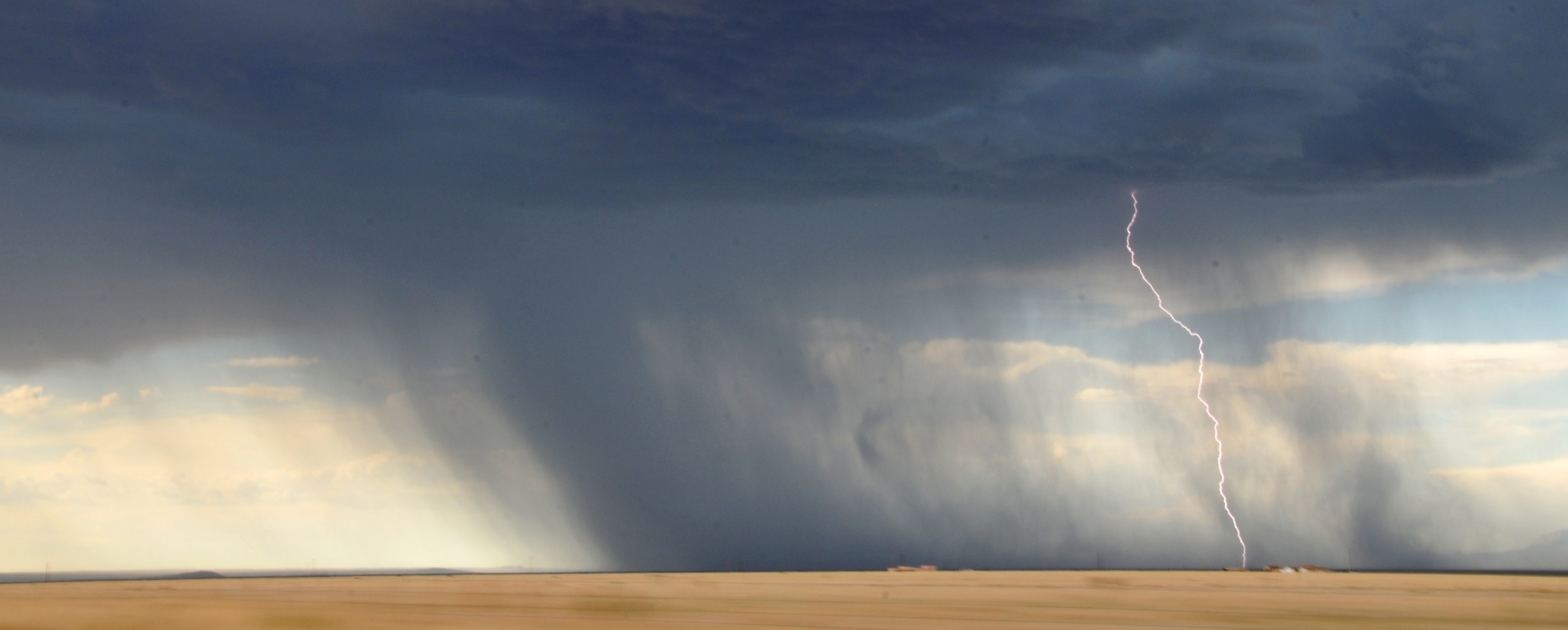
THE NATIONAL WEATHER SERVICE HAS ISSUED A TORNADO WARNING FOR THE LOCAL AREA THAT IS VALID FOR THE NEXT SIX HOURS. THIS IS IN ADDITION TO A SEVERE THUNDERSTORM WATCH FOR THE ENTIRE TRI-CITIES REGION THAT EXTENDS UNTIL MIDNIGHT LOCAL TIME. RESIDENTS ARE ADVISED TO SHELTER IN PLACE AND NOT TO LEAVE SHELTER FOR ANY REASON OTHER THAN AN EMERGENCY.
Now try this:
The National Weather Service has issued a blizzard warning for the region that is valid through the next 24 hours. Accumulation levels during this period will range anywhere from twelve to 40 inches with drifts as high as seven feet possible. Winds during this time may exceed 50 mph, severely limiting visibility. Residents are advised to make arrangements to stay wherever they during this time and to prepare for the possibility of that period extending up to five days.
If you’re like most people, the second paragraph was much easier to read quickly. As covered here in the post Thresholds, when we read, our brains really only scan certain letters of each word and fll in th blnks fr th rst. Because most of us are not used to reading text in ALL CAPS, we have to comprehend the individual letters instead of assimilating full words. This slows down processing and may also affect our ability to comprehend sentences.
If we are just sitting at our computer with “all the time in the time in the world”, this is a relatively minor annoyance. But as Lena Groeger points out so eloquently in the following post, when time is of the essence, font choice and typography can be a matter of life and death.
https://www.propublica.org/article/how-typography-can-save-your-life
Full Article Below

Richard “Rory” Rohde has worked as a Senior Air Traffic Control Analyst at Fort Hill Group since its inception in 2011. He previously worked as an air traffic controller at Washington Air Route Traffic Control Center for over 25 years. Connect with Rory on Linkedin
How Typography Can Save Your Life
by Lena Groeger ProPublica, May 11, 2016, 8 a.m.
After decades of silently shouting at the top of its lungs, the National Weather Service recently announced that it's going to stop publishing its forecasts and weather warnings in ALL CAPS. Beginning May 11, for the first time ever, we'll start seeing mixed-case letters.
The weather service's caps-lock habit didn't happen entirely by choice. Old equipment left over from early weather service days of the late 1800s could only handle capital letters. Unfortunately, people have since learned to recognize those capital letters AS YELLING. It's taken a long time for the weather service (and its customers) to update all their hardware and software, but now they're finally ready to enter the 20th Century.
BEGINNING ON MAY 11, @NOAA'S NATIONAL WEATHER SERVICE FORECASTS WILL STOP YELLING AT YOU. https://t.co/4YjdvUdWxj pic.twitter.com/SAgbtUMMEp
2014 NWS (@NWS) April 11, 2016
For type nerds everywhere, this is a triumphant typographic victory the likes of which we haven't seen since Massimo Vignelli re-designed the New York City subway sign system. Ok, maybe that's a stretch, but type choices are a big deal 2014 and can, in fact, have life or death consequences.
In the case of the weather service's all-caps type, it's the font version of the boy who cried wolf. Using ALL CAPS for everything 2014 from severe hurricanes to a slight chance of showers 2014 means that EVERYTHING LOOKS THE SAME AND EVERYTHING LOOKS IMPORTANT. Once people realize that most of the time it's not, they may become desensitized to warnings. When nothing stands out, people are likely to miss real emergencies.
Now that the weather service can use ALL CAPS sparingly 2014 as a tool to highlight real danger 2014 the public is more likely to pay attention.
"We realized we could still use ALL CAPS within products to add emphasis, such as 2018TORNADO WARNING. TAKE COVER NOW!'" said Art Thomas, the weather service meteorologist in charge of the project. "We hope that using all caps for emphasis will get people's attention when it matters and encourage people to take action to protect their safety."
A light touch on the caps-lock key is not just a good strategy for emphasizing the right things, but also just generally for making text easier to read. Because we see words as shapes, big rectangular blocks of all caps take us much longer to process. In an emergency, that extra time to decipher an urgent message may come at a cost.
Of course, if you're trying to make something hard to read, then all caps is the perfect choice. Companies that set safety warnings in all caps may, intentionally or not, veil important information from consumers.
Here's a version of the Surgeon General's Warning that appears in Edward Tufte's masterpiece Visual Explanations. The warning appears on a cigarette billboard and has been artfully concocted in ALL CAPS, underlined, and surrounded by a dark black border.
Since 1984 all cigarette packages have been required to include one of four specific health warnings, with the "SURGEON GENERAL'S WARNING" phrase set in capital letters. In 2009, President Obama signed a new law that would require larger labels with vivid graphics, but the tobacco industry put up a legal fight, and the new labels have been in limbo ever since.
Companies can (and do) claim that they are trying to "emphasize" the important stuff by putting it in all caps. This is actually the reason so many legal documents and contracts have sections that seem to be shouting. You can blame U.S. law for this one (specifically, the Uniform Commercial Code) which requires that certain sections of a contract be "conspicuous."
Usually those guidelines apply to the parts of the contract that sound something like: "COMPANY X DOES NOT GUARANTEE THAT WE'LL KEEP ANY OF OUR PROMISES AND EVERYTHING IS AT YOUR OWN RISK." Makes sense that those sections should be hard to miss.
Except that in this case, making text "conspicuous," also makes it harder to read. And that's because of a historical quirk. Technically the law defines conspicuous as:
"(A) a heading in capitals equal to or greater in size than the surrounding text, or in contrasting type, font, or color to the surrounding text of the same or lesser size; and
(B) language in the body of a record or display in larger type than the surrounding text, or in contrasting type, font, or color to the surrounding text of the same size, or set off from surrounding text of the same size by symbols or other marks that call attention to the language."
So why do we use all caps instead of bold or italic or even highlighted? Because back when lawyers used typewriters, the only simple way to emphasize anything was to use ALL CAPS. And while today our fancy post-typewriter machines could certainly render the text in other "conspicuous" ways, tradition is hard to break. Just ask the weather service.
But let's look beyond all caps, to perhaps the most famous place where typeface choices might save lives: on the road.
U.S. road signs have been set in a typeface called Highway Gothic since the 1950's, and it was the dominant typeface in use until the early 2000's. But it had problems. Whether people noticed it or not, it was hard to read in rainy weather, from a distance, and at night. When light hit the words, they appeared to blend together in a glowing, blurry mess, something known as halation. This may be annoying to an average person, but if you're an elderly person driving at 70 miles an hour with bad vision, it can be deadly.
So highway engineers struggled to find a solution. They thought maybe making the letters 20 percent bigger would solve it, but bigger letters would require bigger signs and end up costing billions of dollars. So they turned to two designers: an environmental graphic designer and a type designer. Those designers created Clearview, a new typeface that was designed to take up the same space as Highway Gothic but be much easier to read.
One of the most important changes was widening the tiny shapes inside letters called counter spaces (like the hole inside the O or P). But the designers also adjusted the height of the ascenders in characters like b, d, f, h, as well as spacing between letters. And all these changes, taken together, seemed to work! After a bunch of tests in bad weather and different conditions, Clearview was found to improve drivers' reading accuracy, reaction time, and recognition distance. Soon, highways across the country began to adopt Clearview.
However, they won't for much longer. The Federal Highway Administration announced this year that it's not going to require new signs to be in Clearview, due to "significant confusion and inconsistency in highway sign design, fabrication processes, and application." The administration also cites some evidence that Clearview doesn't improve nighttime legibility that much. And so it's throwing in the towel on font innovation, saying it "does not intend to pursue further consideration, development, or support of an alternative letter style."
But elsewhere, life-saving typefaces are still making notable appearances on the road 2014 this time inside the car. In 2012 researchers at MIT partnered up with the typeface company Monotype to tackle the problem of driver distraction. They thought that if they could design easy-to-read screens and displays for inside a vehicle, drivers would spend less time trying to decipher words 2014 and more time with their eyes on the road. To make those screens easier to read, they tried tweaking the typeface.
They settled on a "humanist" style typeface for the job, which has more space between characters and easily distinguishable letterforms. Research suggests that humanist styles are more legible than the widely used geometric and square-shaped typefaces often used by car manufacturers. Here's a graphic from the MIT/Monotype study that demonstrates the difference in counter shapes and other aspects that affect legibility:
The new humanist typeface seemed to work: Total glance time, or how much time a driver spent looking away from the road, went down by half a second for the male drivers in the study (though there was no difference for the female participants). That's a difference of about 12 percent. It might not sound like much, but half a second translates into about 50 feet for the average car driving on the highway. Two car lengths could make the difference between life and death.
Even NASA clearly understands the importance of typography 2014 they have a whole report about it. It's called "On the Typography of Flight-Deck Documentation." In it, NASA scientist Asaf Degani notes, "Although flight-deck documentation are an important (and sometimes critical) form of display in the modern cockpit, there is a dearth of information on how to effectively design these displays."
Effectively designing those displays can indeed be critical. The report describes an incident on May 26, 1987, when Air New Orleans Flight 962 took off for Florida. Before the plane could reach even a few hundred feet, the captain had to make an emergency landing 2014 and in the process managed to roll onto a nearby highway and crash into several vehicles.
It turned out that the aircrew had forgotten to advance the engine levers, which the National Transportation Safety Board said indicated "a lack of checklist discipline." But also possibly to blame? The bad design of that checklist. Here's what the safety board had to say:
The typeface on the Air New Orleans' checklist is 57 percent smaller than that recommended by human engineering criteria. This smaller typeface reduces the legibility of print even under optimum conditions. Although there was no evidence that checklist legibility was a factor in this accident, the Safety Board believes that under other operational circumstances, this deficiency could compromise the intended purpose of this device. Therefore, the Safety Board believes the FAA should take action to verify that aircraft checklists are designed to comply with accepted human engineering criteria.
While NASA most likely has plenty of other safety concerns to worry about, Degani underscores the importance of typography in keeping pilots and passengers safe: "The efficiency and accuracy of reading checklists, maps, airport charts, flight plans, fuel slips, manifests, etc., depends in part on typographical and graphical factors. Moreover, during emergency or abnormal conditions, the flight crew efficiency in accessing, reading, comprehending, and executing procedures has a significant impact on flight safety."
By the end of the report, he's gone through recommendations on everything from line length to color coding to serif vs sans-serif (and yes, he is also opposed to all caps, see #4). Here's the whole list:
NASA's List of Design Recommendations
There are, of course, countless examples of bad typography. Luckily, only a few of them ever come close to contributing to accidents or confusion in times of emergency. But in those cases, even tiny tweaks to a letterform or subtle differences in typeface style become a really big deal. So keep that in mind the next time you hit caps lock.
Know of any more life-saving font examples? Email me at lena.groeger@propublica.org.
ProPublica is a Pulitzer Prize-winning investigative newsroom. Sign up for their newsletter.